Plotting with Matplotlib
Importing Matplotlib
We import the ‘pyplot’ object from Matplotlib, which provides us with an interface for making figures. We usually abbreviate it.
from matplotlib import pyplot as plt
Notebook magics
When we write:
%matplotlib inline
We tell the Jupyter notebook to show figures we generate alongside the code that created it, rather than in a separate window. Lines beginning with a single percent are not python code: they control how the notebook deals with python code.
Lines beginning with two percents are “cell magics”, that tell Jupyter notebook how to interpret the particular cell;
we’ve seen %%writefile, for example.
On MacOS, in some corner cases (virtual environments), %matplotlib inline may need to be the first line in the notebook.
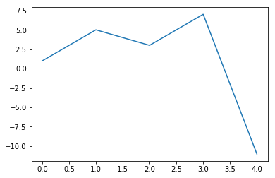
A basic plot
When we write:
plt.plot([1,5,3,7,-11])
[<matplotlib.lines.Line2D at 0x2ae1a57658d0>]
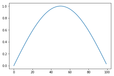
from math import sin, cos, pi
plt.plot([sin(pi*x/100.0) for x in range(100)])
[<matplotlib.lines.Line2D at 0x2ae1a581c470>]
The plot command returns a figure, just like the return value of any function. The notebook then displays this.
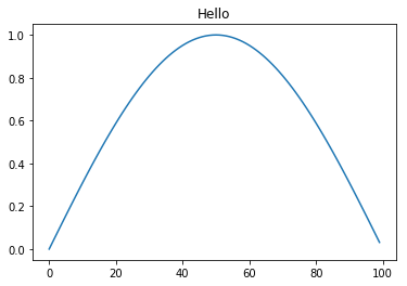
To add a title, axis labels etc, we need to get that figure object, and manipulate it. For convenience, matplotlib allows us to do this just by issuing commands to change the “current figure”:
plt.plot([sin(pi*x/100.0) for x in range(100)])
plt.title("Hello")
<matplotlib.text.Text at 0x2ae1a58668d0>
But this requires us to keep all our commands together in a single cell, and makes use of a “global” single “current plot”, which, while convenient for quick exploratory sketches, is a bit cumbersome. To produce from our notebook proper plots to use in papers, Python’s plotting library, matplotlib, defines some types we can use to treat individual figures as variables, and manipulate this.
Figures and Axes
We often want multiple graphs in a single figure (e.g. for figures which display a matrix of graphs of different variables for comparison).
So Matplotlib divides a figure object up into axes: each pair of axes is one ‘subplot’.
To make a boring figure with just one pair of axes, however, we can just ask for a default new figure, with
brand new axes
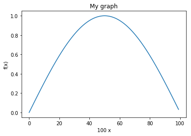
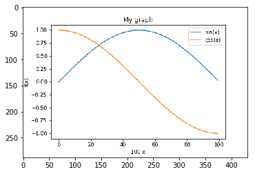
sine_graph, sine_graph_axes=plt.subplots();
Once we have some axes, we can plot a graph on them:
sine_graph_axes.plot(
    [sin(pi*x/100.0) for x in range(100)],
    label='sin(x)')
[<matplotlib.lines.Line2D at 0x2ae1a58acd30>]
We can add a title to a pair of axes:
sine_graph_axes.set_title("My graph")
Text(0.5, 1, ‘My graph’)
sine_graph_axes.set_ylabel("f(x)")
Text(3.2, 0.5, ‘f(x)’)
sine_graph_axes.set_xlabel("100 x")
Text(0.5, 3.2, ‘100 x’)
Now we need to actually display the figure. As always with the notebook, if we make a variable be returned by the last line of a code cell, it gets displayed:
sine_graph
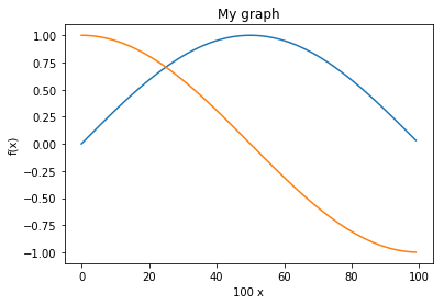
We can add another curve:
sine_graph_axes.plot([cos(pi*x/100.0) for x in range(100)], label='cos(x)')
[<matplotlib.lines.Line2D at 0x2ae1a588ccc0>]
sine_graph
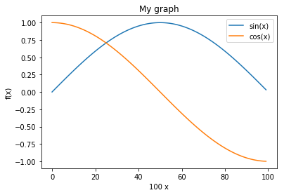
A legend will help us distinguish the curves:
sine_graph_axes.legend()
<matplotlib.legend.Legend at 0x2ae1a58c9438>
sine_graph
Saving figures.
We must be able to save figures to disk, in order to use them in papers. This is really easy:
sine_graph.savefig('my_graph.png')
In order to be able to check that it worked, we need to know how to display an arbitrary image in the notebook. You can also save in different formats (eps, svg, pdf…)
The programmatic way is like this:
import matplotlib.image as mpimg
img = mpimg.imread('my_graph.png')
imgplot = plt.imshow(img)
Subplots
As we will see plt.subplot() takes three arguments.
The first argument is the number of rows in our grid of plots, the second is the number of columns and the third is the number of the plot we are currently working on (this counts from 1, not 0) and progresses from left to right and top to bottom. This is illustrated below.
Diagram: subplot grid

We might have wanted the sin and cos graphs on separate axes:
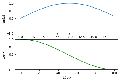
double_graph=plt.figure()
<matplotlib.figure.Figure at 0x2ae1a59042b0>
sin_axes=double_graph.add_subplot(2,1,1)
cos_axes=double_graph.add_subplot(2,1,2)
sin_axes.plot([sin(pi*x/20.0) for x in range(20)])
[<matplotlib.lines.Line2D at 0x2ae1a5e067b8>]
sin_axes.set_ylabel("sin(x)")
Text(0, 0.5, ‘sin(x)’)
cos_axes.plot([cos(pi*x/100.0) for x in range(100)], 'g')
[<matplotlib.lines.Line2D at 0x2ae1a5e0d320>]
cos_axes.set_ylabel("cos(x)")
Text(0, 0.5, ‘cos(x)’)
cos_axes.set_xlabel("100 x")
Text(0.5, 0, ‘100 x’)
sin_axes.set_xlabel("20 x")
Text(0.5, 0, ‘20 x’)
sin_axes.set_ylim([-1,1])
cos_axes.set_ylim([-1,1])
(-1, 1)
The command ‘set_ylim’ sets the data limits for the y-axis. In the example above the bottom limit is set to -1 and the top limit is set to 1.
Similarly, the command ‘Set_xlim’ sets the data limits for the x-axis.
Detailed information can be found in the Matplotlib documentation: https://matplotlib.org/api/axes_api.html#axis-limits
double_graph
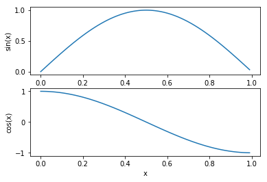
Versus plots
When we specify a single list to plot, the x-values are just the array index number. We usually want to plot something
more meaningful:
double_graph=plt.figure()
sin_axes=double_graph.add_subplot(2,1,1)
cos_axes=double_graph.add_subplot(2,1,2)
cos_axes.set_ylabel("cos(x)")
sin_axes.set_ylabel("sin(x)")
cos_axes.set_xlabel("x")
<matplotlib.text.Text at 0x2ae1a5e92a58>
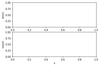
sin_axes.plot([x/100.0 for x in range(100)],
              [sin(pi*x/100.0) for x in range(100)])
cos_axes.plot([x/100.0 for x in range(100)],
              [cos(pi*x/100.0) for x in range(100)])
[<matplotlib.lines.Line2D at 0x2ae1a5e546a0>]
double_graph